
illustrator
typographic poster

For my typographic poster, I created a retro, 70's look. Where leg warmers, afros, and soda pops took place. I chose this era in time because the 70's-80's time was very fascinating to me personally. I will forever wish i was a 70's kid, or even an 80's kid. Groovy times all the way. Something about that time really catches my eye, maybe all the fun colors and snazzy outfits that trended back then.
Blue dog

For my blue dog project i decided to make my dog harmonize with warm colors. I chose warm colors because in my opinion warm colors bring a type of happiness and a nice, soulful perspective. My dog represents a living with god due to the sweet living and blessings coming into my life with great vibes and happiness. My background is more of a settle look with the contrast colors from my dog representing a balance in life that deals with responsibilities and priorities that I have to achieve and work for, for the life I want.
Bird project #18
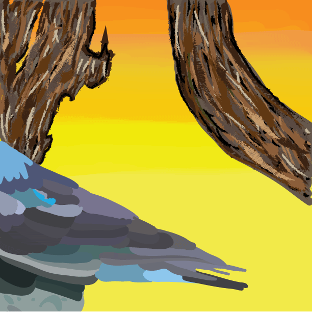
For my bird project, i used multiple skills and techniques to try and create a unique and different look than other birds. I made the tree a rough look because i thought it would look nice with the smooth background i was going for. i made the bird multi-colored for the feathers to recognize the bird from the tree and background. I made the tree, bird, and background with different techniques to create a balance between the three and so all three can stand out from each other.
Wrestling postor

For my wrestling poster a chose an image with both JV and Varsity, as well as the coaches because it shows an appreciation for all participants that make our wrestling team a unique whole. Then, i took a lot of time and effort to make the poster more intense with the background of a kind of storm representing a more serious advance. then, i kept an organized view by putting sponsors together at the bottom, the individual pictures on top, and the schedule on the top top so it would be easy to locate and understand.
T-Shirt logo

For my T-Shirt logo i chose an image of Drake as a cartoon character. Not only because he is a legend of all time and one of my top three artists, but because i thought the image was different and definitely a style I personally would wear on a T-Shirt. I thought it was really cool that we could pick from a variety of photos to put on a t-shirt and have the opportunity to create our own piece of clothing. I've never done this in any other class, but I would love to come across it again.